CONRAD’S BIKE SHOP
TYPE eCOMMERCE GOAL REBRAND ROLE UX RESEARCH + DESIGN

Imagine you’re my friend Maria—she’s a kickass lawyer and avid cyclist in NYC. She works hard, plays harder—and wanted to treat herself to a fancy, custom built titanium bike. There’s ONE bike shop in New York City which has an amazing reputation specializing in just that. It’s name: Conrad’s Bike Shop.
Maria goes to Conrad’s website to check out all of the high-end titanium bikes and is shocked to find that hardly anything on the site is clickable. Not any of the high-end bike brand logos, not any of the photos of the bikes on the home page.
Certainly, this is not what any NYC cyclist would expect of a high-end bike shop! I decided next my mission was to save her and the cyclists of New York!
“Why can’t I click a damn thing on this site?!”
—Maria F.
liquid RESEARCH
A VERY BIKEY BRUNCH To start the research process, I invited Maria and a few friends for a bike brunch ride to chat about Conrad’s and other NYC bike shops! Understandably, they were shocked to find Conrad’s web presence in such a state, especially since the other bike shops have very robust, slick sites.


NEW YORK-SPECIFIC DATA!

THE CASE FOR CUSTOM-BUILT BIKES
Size matters The geometries of stock bikes do not fit all body types.
Custom needs You might want something more tailored to your needs.
Supply chain issues We are in the midst of an everything-shortage
brought on by the pandemic, with 60% of road bikes made in China.
HOW the heck was I gonna tackle this massive overhaul?
WHY… by breaking it down my friends, and diving even deeper into competitor sites!
I'm no JUNG nor Freud,
but I DO love Analysis!
I performed a Heuristic Analysis of 6 competitive sites using the LEMErS framework:
• Bike Selection
• Filtering
• Clearly laid out Bike Options
• Online purchase
• Site Design—is it modern, clean, easy to navigate
As you can see, Conrad’s site was seriously lacking!

COMPETITIVE ANALYSIS
To inform design solutions, I used the Task Analysis approach, fake-performing the purchase of a new bike on Strictly Collective in 7 simple steps.

Home
1. Bikes
2. Road Bikes
3. Performance
4. Select Bike
5. Add to cart
6. Proceed to checkout
7. Place order
A Feature Inventory was also performed across 6 competitors to validate the inclusions I intended for Conrad’s makeover.
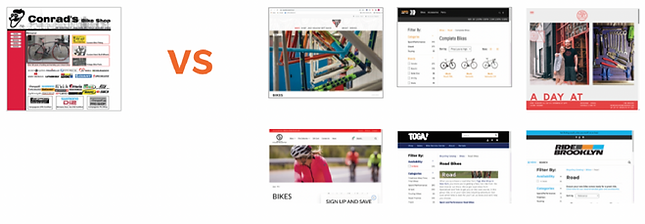
COMPARATIVE ANALYSIS
To hone in on, and develop priority features, I did a deep dive on 3 sites considered
Best in Class.

CONRAD'S SPECIAL SAUCE
High-end customers deserve a high level of service. And that’s how Conrad’s has built the reputation they are most known for—their custom builds. Here is where you will find gold star frames and components, and expert consultations on well-curated configurations.
Ensuring bike happiness is their number one priority, and they are truly happy to help
all cyclists!
For example, they can outfit your road bike with easier MTB gearing to tackle tough climbs. OR turn your bike into an e-bike. The bike should work for you. Not the other
way around!
THE CONRAD'S CUSTOMER
The typical Conrad’s customer type is the Careful Critic!
QUALITY is PRIORITY #1!
• Extensive research
• Compares multiple items before choosing
• Thoroughly reads descriptions and
reviews with scrutiny
Needs and Goals: A functioning site where she can configure a custom build.
Frustrations: Other shops do not stock the Titanium brands, nor do they have the reputation that Conrad's has for custom builds.
She really prefers to shop at Conrad's, if only the site worked.

DECONSTRUCTING COMPETITOR SITES
I deconstructed and examined the top 10 bike shop sites and found that they used
the same model, nav and filtering system!

BUT, since CONRAD’s is a specialty shop selling curated configurations, I had to plan
a bit differently. Therefore, I created a User Flow and Sitemap that provided the User
with as much ease as possible building their new bike!


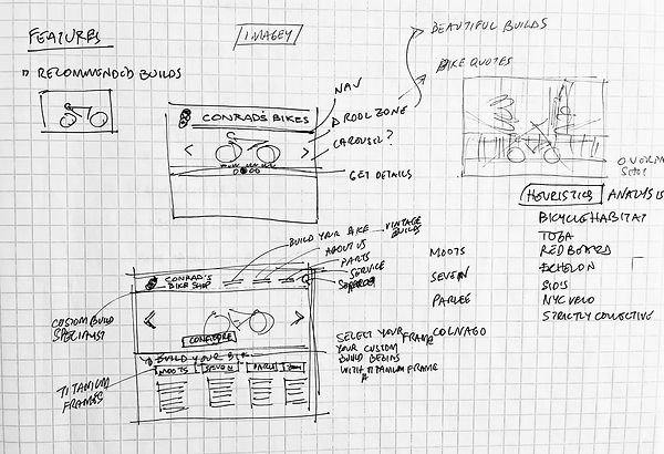


GETTIN' SKETCHY WIDDIT
I had to ensure that the task of choosing and purchasing a curated bike build would be elegant and smooth. Presenting information cleanly and clearly, helps to make the customer comfortable with Conrad’s expertise.
Here a Fi, there a Fi, everywhere a Fi-Fi!
A few rounds of Lo and MidFi prototyping were needed to fine-tune a foolproof flow, and a great opportunity to add in features that came up in User Testing!
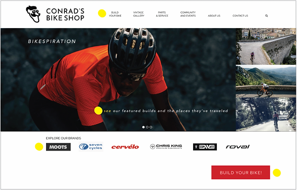
Users wanted to see featured builds for inspiration and literal street cred, so I created a hero collage called Bikespiration, showing Conrad customers and their bikes in actual vacation photos.
Users also wanted to know where they were in the process, so a Progress Bar
and breadcrumbs were added.
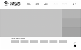
TAH DAHHHH! HiFi version 1!
A HIGH-FIDELITY PROTOTYPE WAS BORN!
I was so proud of this version... until User Testing revealed a few pain points!
Version 1
Even though I had built 4 ways in to start the Custom Build, I never explained who Conrad's was, nor the Conrad's process!

Copy was added to let folx know who Conrad's is, and why they should trust them with a Custom Bike Build. Also, an explanation of the Process was added so that clients would know what to expect.

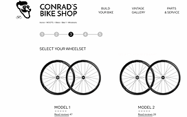
Select frame!
let's build a BIKE!


Brand page
lovin' THE FLOW


Checkout!

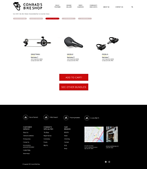
Pick Bundle!
Add Wheels!
CLICK HERE TO SEE THE PROTOTYPE!
thank you! :)
NEXT STEPS AND REFLECTION
NEXT STEPS
I can't wait to finish the mobile version and hopefully pitch the project to John, the owner of Conrad's. He
IS old school and set in his ways, but a lovely, lovely person and I look forward to bringing him into
modern times.
REFLECTION
Being an NYC cyclist myself made this a fun and exciting project, and one that I hope takes a bit of a different bent from the typical eCommerce bike shop sites, which are mostly in catalogue format. I haven't seen a bike shop site like this one, so I am really hoping to offer custom-build shoppers a pleasurable experience they can feel confident about.
Wish me luck! ;)

.png)